UX CASE STUDY
⬇
UX CASE STUDY ⬇
Virtual Vinnies
Helping users find local Vinnies locations & donate accepted items
About Vinnies is seeking to enhance their current process for accepting and selling donated clothes to attract desirable donations, increase interest and create more sales.
The Society of St Vincent de Paul, also known as Vinnies, has a mission to create a more compassionate society through creating positive change in local communities. Vinnies charity shops play a crucial role in achieving this mission by selling affordable and pre-loved items to give back to the community, which also reduces waste.
OverviewProblem
The rising trend of fast fashion has negatively impacted the environment. Australia is notoriously bad for textile landfill in particular with Australians discarding 6 tonnes of textiles and clothes every 10 minutes (Source: Ragtrader). Because of the fast turn over of trends in the fast fashion space, Vinnies is seeing an increase in consumer donations that are “expired” or “out of trend”.
Outcome
We designed a ‘Virtual Vinnies’ app which helps users find local Vinnies locations and donate accepted items.

-
Role
Project Lead
UX/UI Designer
Illustrator -
Team Size
4 UX/UI Designers
-
Software
Figma
Figjam
Google Suite -
Scope
2.5 week sprint
Design Strategy, Research, User Interviews, UI/UX Design, Prototyping, User Testing, Final Presentation -
Project Type
Conceptual Project
PROJECT GOALS
Goal 1
Understand the current way Vinnies accepts and sells donated items.
Goal 2
Understand how people donate items, when, to whom, and the reasons why so that Vinnies can better serve the community.
Goal 3
Look for opportunities to attract desirable donations and increase sales for Vinnies.
What is the Value for Vinnies?
MEASURING SUCCESSObjective
To help people know what to donate and what condition it should be in to improve the quality of donations, and in turn increase sales for Vinnies to further support the community.
Key Results
➔ Less dumping of unusable items to Vinnies
➔ Higher quality of donations
➔ More frequent donations
➔ Higher revenue from sales to go toward Vinnies’ core missions
➔ Enhanced brand image and trust for Vinnies
Initiatives
➔ Notifying donors to be more mindful of what they are donating
➔ Giving them convenient ways to donate more frequently
➔ Providing donators additional ways of donating

We dived into market research to gain insights into our problem space and found…
MARKET RESEARCH
Charities are paying tip fees to dispose of 250,000 tonnes of dumped, damaged clothing and goods each year Source: Nacro)
In 12 months, Australians donate more than 780,000 tonnes of clothing and goods to charity stores (Source: Charitable Recycling Australia).
Only 16.5% of donated items actually make it to the charity store sales floor (Source: Charitable Recycling Australia).
Furthermore, after researching various charities and their market presence, we discovered that both The Salvation Army and Red Cross had embraced the digital realm by developing apps to enhance their operations. This finding played a significant role in our choice to create an app for Virtual Vinnies, aiming to boost donation levels on a digital platform.
However, the best way to gain deeper insights was for us to go out on the field to interview people who donate or buy from charity, and talk to volunteers that work in charity shops
From conducting interviews, we gained deeper insights into what people are donating, why they choose to donate and how they donate. In doing so we could identify potential pain points and gaps where we could make the experience of donating less confusing.
We interviewed 46 donors and consumers and 10 charity volunteers/employees which helped us develop a rounded overview of the problem space. We also conducted a survey with 67 responses received.
From which we then created insights and Affinity mapped.
We pulled three key insights out that we gained from the above research
KEY RESEARCH INSIGHTS
These were picked out of the survey and affinity map as the core areas of interest due to the amount of insights in each of these sections and how closely they correlated to each other alongside our previous research.
People donate to get rid of unwanted items and give back to the community.
The overwhelming majority said they donate to get rid of unwanted items (65.7%) and because they ‘like to give back to the community’ (62.7%).
This data was also backed up by our affinity map which showed key reasons to donate where to get rid of unwanted items and give back to the community with taking care of the environment also showing as being an important factor for those people.
“I think it’s a great thing for the community especially for those in need who can’t afford a lot”
–Quote from survey
People drop off physical donations to places in close proximity and when it is most convenient for them to do so.
77.6% of people who answered our survey chose to drop off at a charity donation box with the following 59.7% and 46.3% saying they would drop off in store or donate online respectively.
This data was backed up by affinity which showed people had a tendency to drop off their physical donations to places in close proximity or when it was most convenient for them to do so.
“It’s important to donate things with integrity.”
–Quote from survey
Volunteers often receive donations that could not be sold in store.
People don’t know what they can and can’t donate. From interviewing volunteers we found that the majority received items that were not in good enough condition to pass on. We also discovered that certain stores had restrictions on what items they could take in due to size of items and safety regulations.
Imagine you are The Good Samaritan (TGS). You are a kind and empathetic person who wants to make a difference in their community. You donate every 1-3 months, but sometimes struggle with finding drop-off locations and knowing what to donate. You are motivated to donate by friends and family, and will often research a charity before committing.
Despite these challenges, you like to donate in different ways and always try to be mindful of what you give. You want to make a positive impact in the local community and the environment.
The Good Samaritan
BUILDING AN ARCHETYPE
Key Takeaways:
Wants to support their community
Researches a charity first before committing
Wants to know the closest location for donation
Wants to know what can and can’t be donated
Wants to donate in a variety of ways

The Good Samaritan needs to know what items can be accepted as donations so that they can help those in need.
PROBLEM STATEMENT
Using a modified version of the ‘Crazy 8’s’ UX method for rapid ideation I time blocked the team to sketch sets of 4 sketches in 4 minutes using the below ‘how might we’ statements.
IDEATION
How might we…
Show The Good Samaritan what items can be donated?
How might we…
Help The Good Samaritan donate more?
How might we…
Show The Good Samaritan where their donations can be accepted?
How might we…
Let The Good Samaritan know what condition their donated items need to be in?

We took a ‘cut and paste’ approach, digitally cutting our sketches up and fitting them within a linear flow
We took a ‘cut and paste’ approach, digitally cutting our sketches up and fitting them within a linear flow
We each developed up on own ideal flow from our previous ideation, which I time blocked to 10 minutes, then came back as a team to discuss each of our individual flows, and which features we should prioritise based on our archetypes needs.
Following this discussion, myself and the other two designers focused on refining up our ideal flows into one single flow and crafting the UX writing for each screen, ensuring a smooth experience moving through the MVP. I delegated the task of resketching each screen to another team member, who prepared them for implementation in Marvel.
The wireflow myself and two other team members worked on, where we discussed UX writing. As all of us are visual thinkers this way of working allowed us to quickly make decisions.
Resketched flow which was prototyped up in marvel and user tested.
We began to document our users journey through our first paper prototype.
USER TESTING
The task we gave our users was “Imagine you are someone that is looking to donate some unwanted items you have around home. You've found an app from Vinnies that allows you to upload images of your items to assess the quality. Please walk through the steps you will take to donate your items. “
Spreadsheet of our test findings
Although our initial prototype was rudimentary we gained some valuable insights from user testing which we acted upon when we moved towards a mid-fidelity prototype on Figma.
USER TESTING ITERATIONS
1
UX Writing
We knew we needed to keep postcodes as a core part of our prototype. However, from user testing we found our hierarchy was off. Moving towards mid-fi we gave the user more context around WHY they were putting their postcode in to reassure them of the process they were moving through.
2
“Rate one to donate one”
Rate one to donate one was an idea where we believed The Good Samaritan could get more involved with the community by helping to also rate others items as acceptable or not. Through user testing we found that this was leading to confusion and hesitancy. In the case of a user I tested, when presented with this feature it led them to feel uncomfortable.
I facilitated a conversation with the team when we next met around cutting this feature out due to the comments we had received during user testing, and ultimately we decided it was best to be removed from our MVP.
Idea removed from MVP due to confusion/ hesitancy/ users feeling uncomfortable.
3
Would you give this to a friend?
Because we cut out the ‘rate one to donate one’ feature we decided to keep the feature where the user rates their own clothes as a measure of accepting items as it was more user focussed. The decision was made that ‘would you give this to a friend?’ was too confusing as a prompt for the first question with no other context, so this was changed to “Quality Check” with questions such as ‘does this item have holes or stains’ instead.
However, as we were working through our Mid-Fi we got to a sticky point. We started to question ‘do we really need an add photo feature?’.
I got the team to go back and look at our archetype, The Good Samaritan, and also our problem statement to answer this crucial question. We had strayed too far from our original design purpose.
The solution we were developing was too complex for the task that The Good Samaritan wanted to perform; finding out what they can and can’t donate so they can help those in need.
The decision was made to cut the middle out, keeping the start and end of our flow. This effectively simplified the prototype and once again brought us in line with our research and problem statement.
As project lead I made sure to copy over our archetype and problem statement onto our Figma board to have as a continuous reminder for the team of who we are designing for and why.
Making decisions on the direction for branding
Vinnies corporate colours are dark blue, yellow, and white.
However, when we looked into Vinnies and their communications with the wider community we found they also introduce a light blue into their colour palette.
We found that this light blue, with illustrative elements, resonated more with our archetype, with the light blue giving the application a lighter approach, so we designed the final solution based on this branding collateral.
I contributed some new illustrations to sit alongside the ones that Vinnies had previously developed. We kept the UI elements round, to keep the application looking approachable and fresh.


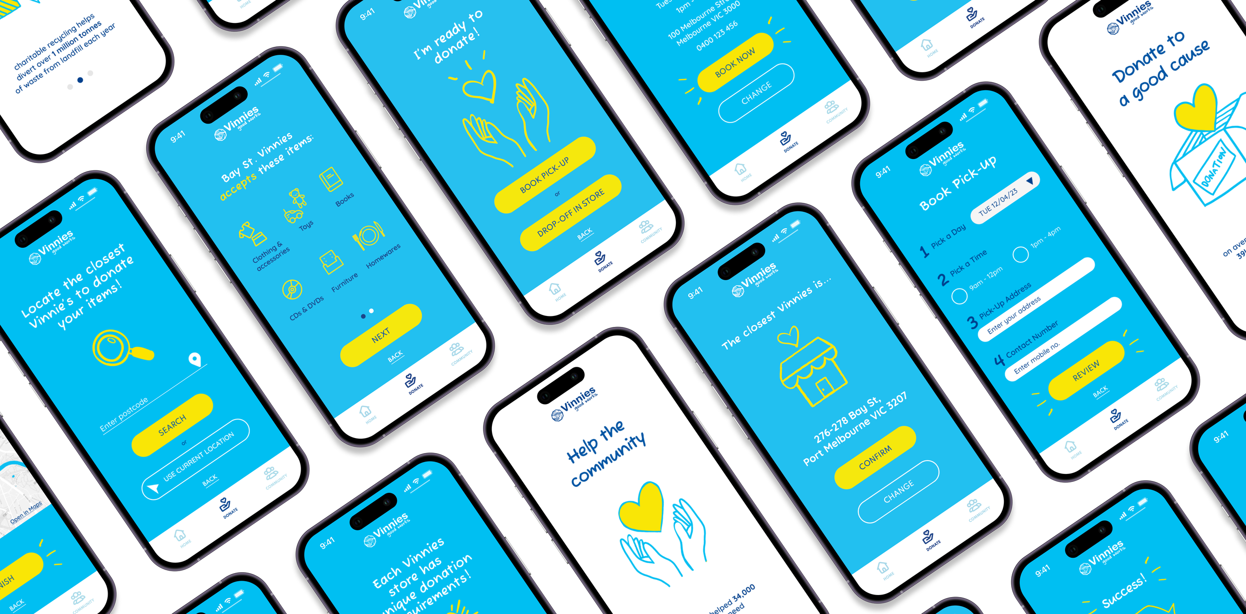
The Solution
1
The Good Samaritan wants to make a positive impact in the local community and the environment.
We start with onboarding that highlights Vinnies core mission in relation to the application. This gives The Good Samaritan peace of mind to continue, as highlighted in our research “will often research a charity before committing”.
2
The Good Samaritan sometimes struggle with finding drop-off locations and knowing what to donate
For this flow we explored the solution being in relation to The Good Samaritan donating based on their location. We prioritised this flow because our research demonstrated that people value being able to donate when it’s in close proximity.
3
The Good Samaritan always tries to be mindful of what they give
Our research showed that different locations allow different items so we followed the accepted location with what that specific location could and couldn’t accept.
4
The Good Samaritan wants to donate in a variety of ways
Part 1
Once The Good Samaritan has viewed what their local vinnies accept and doesn’t accept they are prompted to donate via pick up or drop off. If TGS chooses to book a pick up they’re prompted to enter their pick up details. If they choose to drop off they are shown the best route to the store.
For this flow we explored the solution being in relation to The Good Samaritan donating based on their location. We prioritised this flow because, as mentioned previously, our research demonstrated that people value being able to donate when it’s in close proximity.
5
The Good Samaritan wants to donate in a variety of ways
Part 2
Lastly, The good samaritan lands on a page that allows them to also leave a monetary tip as they want to be able to donate in a variety of ways. We used ux writing to make some fun copy that tied back to The Good Samaritan’s commitment to the environment “You’ve stopped us filling the tip, why not also leave a tip”.

Outcomes from Solution
Improved donation quality will save Vinnies money and time spent sorting unusable items, freeing up staff time and budget for Vinnies to prioritise their core mission of aiding those in need
Higher quality donations will enhance Vinnies brand image, build customer trust, and increase support for their mission
Higher quality donations will result in increase sales, attract more customers, and generate more revenue for Vinnies
Next Steps for Virtual Vinnies
As this project focused on developing up an MVP and it was a short sprint we had to be strategic about the screens we were developing up further. However, from our ideation there was a next step we felt like could still be useful for The Good Samaritan.
This would involve creating a screen, such as the below, for users to select the type of items they would like to donate and are provided with a list of locations that can accept those items, as our research found some locations wouldn’t accept certain items such as electronics.
The benefit for this feature would be so that users have an option of donating things that they have, with the goal of reducing landfill

My personal takeaways from this project
As the project lead for this UX project, I found the design prompt for Vinnies to be interesting, content rich, and a good challenge. I enjoyed keeping the momentum of the project going through time blocking each deliverable and delegating work to team member based on each persons individual strengths.
The most demanding phase of the project was when we faced a critical decision point of removing a large feature from our MVP. As a team, we had invested considerable time and effort into the prototype, making it challenging to consider letting go of certain features. However, this provided an opportunity for me to facilitate a difficult conversation among team members which was a moment of growth for me.
This experience made me appreciate the importance of staying focused on the users' goals to guide our decision-making process.